
 Sign In

The Wardrobe Architect Week 6: Organizing your palette

The Wardrobe Architect is a popular series that ran in early 2014. It’s currently being expanded (with help and feedback from you) into a comprehensive toolkit. You can read all the posts here. If you want to give feedback and get first access when the toolkit is finished, enter your email:
Last week, we discussed the idea of creating a palette that represents your own unique tastes and preferences.
So the question now is, how do you go from a list of colors to a wearable palette? How do you decide which colors you need more of, and which you need fewer of?
To help us along, we’re going to organize our favorite colors this week.
I’ve divided my palette up into 3 parts: neutrals, near neutrals, and statement colors. I’ve also added one more category, metallics. I’ll go through each one in turn, showing you my own choices.
Once you have your palette categorized like this, it will be easier later to create smaller palettes for seasonal wardrobes. We’ll cover that process in the coming weeks.
Neutrals
Neutral colors are basics that go with just about anything. Think browns, grays, black, white, beige, etc.
Generally, neutrals convey an air of sophistication and elegance, though they can become boring if used exclusively or untempered by other kinds of visual interest, like texture, silhouette, or detail.
I find that the more neutrals you incorporate, the easier it is to build outfits from just a few pieces. If you’re not into neutrals, that’s absolutely fine, but I do think that without neutrals you may need to own more clothing to create the same variety of looks. It really depends on your personal preferences.
Just keep in mind that a healthy serving of neutrals (or nearly neutrals, our next category) helps to keep things simple. I pulled out the neutrals from my palette:

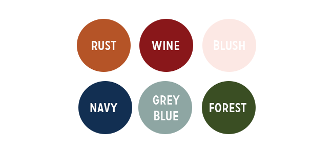
Nearly Neutrals
I call these colors “nearly neutrals” because they act like neutrals but have a little more visual impact.
Your own definition of nearly neutrals can vary. Think of colors that seem to go well with everything, like burgundy, navy, wine red, very pale blush pink, olive green, gold, etc.
Nearly neutrals are anything you personally wear like a neutral. You feel confident combining them easily with other colors.
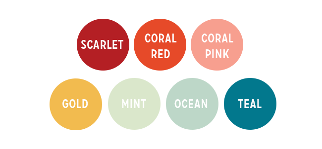
Statement Colors
These are the colors that don’t necessarily go with everything, but have a lot of visual impact. For me, these colors elicit some of the strongest feelings. They have a lot more visual weight, and they tend to make clothing more recognizable.
Statement colors can be used in large or small doses. You can have many of them, or just a few.
Metallics
Metallics will probably be most present in the jewelry you wear, but might show up in other places too (shoes, buttons, bag hardware, etc).
I love metallics because they act like neutrals but have a bit more spark to them.
I find that people are usually drawn to either cool metallics (silver, white gold, pewter, platinum) or warm metallics (gold, bronze, copper, rose gold). I am definitely of the warm persuasion.

Exercise
Organize your palette. Take your collection of colors from last week and try dividing it into the categories above: neutrals, nearly neutrals, statement colors, and metallics. If you feel like adding more colors to your palette at this point, go ahead! I added metallics to mine.
Discussion
Do you feel like your color choices are balanced, or do you lean more toward neutrals or statement colors?
PS: Guess what, you guys? This is the 1,000th post on this blog! Thank you guys for being with me through the years, I’m so thrilled to have made it this far. I’d like to be more reflective, but I’m still on work-cation right now (writing this poolside with a G&T, in fact), so for now I’ll just say a sincere thanks.
Comments
Becky
February 20, 2014 #
It’s definitely all about the statement colors for me! I was just looking at my palette from last week- out of 16 colors total, 5 are neutral (ivory, camel, chocolate, grey and black), 2 are near-neutrals (olive and navy), and the remainder were all statement colors! I’m really not surprised at this, since I’m a printoholic, and the statement colors are what really make a print stand out for me. I’m ok with needing to have a larger closet to have the variety, though, because that means I’ll always have something new to sew!
Andrea_R
February 20, 2014 #
I have definitely narrowed my palette down: black, grey, brown (chocolate), olive (not so much) navy, teal, red, and chartreuse is THE statement color. All with silver.
Isabel
February 20, 2014 #
Interesting having to group then – I was tempted to add mustard yellow and red to my neutrals :) I also added some metallics. Copper is a big one with me at the moment, but also wear old silver and old gold.
Grous in my pinterest board for colour, link below.
http://www.pinterest.com/pin/526217537682933818/
Kathy
February 20, 2014 #
Don’t forget about the option of seeing a custom color analyst to learn your best colors! Look for someone trained to do completely custom analyses (rather than someone who gives you a premade palette), and someone who gives you real fabric swatches (much easier to match than paint chips, etc). You can see examples of custom fabric palettes here: https://facebook.com/BeautyValued. I work in person or online using TONS of photographs. Am just gettimg back into sewing so am enjoying your blog!
Clémence
February 20, 2014 #
Congratulations on your 1000th post!
And thank you for taking the time to write it during your work-ation. I don’t have a blog but I can imagine the work (and the stamina) needed to write interesting content… I really appreciate the wardrobe architect and looove your links lastly. I enjoyed every article you pointed us to, espacially those who invited us to think about fashion and its deeper meaning (oh, and the one about the sapeurs!).
About colours, I notice that I love statement colors (indian pink, bright yellow, orange), but am in a bit of a beige rut when it comes to wearing colors. And as far as metallics are concern, I am definitely on the warm side.
Spyderkl
February 20, 2014 #
Thanks for doing this series. It’s really helped both me and my tween daughter, who’s just moved into the junior clothing section and completely confused about what she wants to wear. She asked if we could both do this, by the way.
My palette, once it was whittled down, wound up being mostly neutrals (black, brown, light gray) and a couple of statement colors (bright purple and blood red, for lack of a better descriptor). Metallics? I’d never really thought about that being a part of a wardrobe palette, but yeah. Definitely on the cool end.
Adri H.
February 20, 2014 #
Woot! 1000 posts!
Ingrid
February 20, 2014 #
My issue is that there are so few colors I like wearing. Nearly everything I own is black or navy. I have some white, but it’s impossible to keep clean, so I usually don’t wear it very often, and it therefore isn’t a big part of my palette. I tried adding some chocolate brown, but it hasn’t really stuck, and I don’t reach for it nearly as often as black/navy. My statement color–yes, there is only one–is yellow. Whenever I wear anything else, like rocket red or pinks/oranges, they’re always on a dress, usually of the fancy variety, that doesn’t do well outside of a cocktails/party scenario. Maybe I just need to start wearing more colors…
Béa
February 20, 2014 #
I had fun with the colour palette tasks!
My colours are on my blog post here: http://beassewingadventures.wordpress.com/2014/02/20/wardrobe-architect-5-colour/
This made me realise that my wardrobe is dominated by one neutral- black, but brings in many different statement colours. I love bright bold colours, and I wear them a lot, with the black tempering them. I tend to wear either shades of pink & purple, or shades of turquoise, teal and green. I believe I’ve got a reasonable eye for colour and generally my colours work with each other.
The one realisation the WA process has brought me this week, is that chartreuse is the nearest thing to yellow that I wear! I’ve always steered well clear of yellows and oranges because of my skin tone, and didn’t think I had any yellow in my wardrobe, but once I twigged that chartreuse was effectively a cool blue-toned yellow (rather than just a version of green) it made sense to me why I was happy to wear it, and it balances my palette a bit!
Kimberly Giberson
February 20, 2014 #
I am definitely lacking neutrals in my wardrobe. I gravitate toward statement colours. This would explain why I never have anything to wear!
I really like some of the nearly neutral examples you gave (rust, wine and blush). I hadn’t really thought of those colours as neutrals before. When I am planning sewing projects in the future I am going to focus on incorporating more neutrals.
Sarah
February 20, 2014 #
Great fun! I’m only just starting this project but enjoying it immensely and loving polyvore. Congrats on the 1000th post! A poolside G&T sounds super!
Marie
February 20, 2014 #
This series is so wonderful, and exactly what I needed. I have joined in (late), and have just organised my colour palettes! It’s so satisfying to have all the colours sitting neatly in categories. Plus it made me realise I wear bright blue as a nearly neutral!
blogged at: http://ree-sewn.blogspot.co.uk/2014/02/i-want-to-be-wardrobe-architect-too.html
Anne in Japan
February 20, 2014 #
Congratulations on the 1000th post!! I really enjoy your blog – it’s one of the best out there. I’m about to move countries so don’t have time to do the Wardrobe Architect exercises right now but I am so looking forward to working my way through them when I am settled again. (I am taking the move as an opportunity to finally have a big clear-out and look forward to organising – and sewing – myself the perfect wardrobe – with your help.)
Sounds like you’re having a great work-cation. Another brilliant idea!!
Niamh
February 21, 2014 #
Thanks Sarai!
I’ve been thinking recently that there is far too much black in my wardrobe. It’s definitely my go-to neutral, stemming from needing ‘theatrical blacks’ for my days in youth theatre clubs, and an admiration for all things gothic (even if I never quite had the confidence to wear those styles). Autumnal near-neutrals suit me best, and it’s now a goal to bring more of those colours into my wardrobe as I phase out worn-out or ill-fitting blacks.
I’ve determined that 2014 is going to be the year that I get into the habit of wearing clothes that fit me properly, and the Wardrobe Architect exercises are really helping to assess what I need from my clothes in terms of fit and comfort.
Kat
February 21, 2014 #
This sounds quite like me…. although I DID wear gothic stuff ;)
I also decided to just have clothes that fit. I can´t waste the money on having not fitting things!
I´m still catching up wir Wardrobe architect ( still doing my colors palette) so I´m not having grouped them yet. My neutrals now are black and few white. I want to incorporate more neutral shades to my wardrobe, cause black does not suit me best :)
Niamh
February 24, 2014 #
I had to laugh the other day – I was browsing some clothes shops at lunch, and was struck by the loose, relaxed fit that seems to be in at the moment. Typical of me to decide I want fitted clothes when the exact opposite is the order of the day!
Zoe
February 22, 2014 #
I’ve just been collecting my colours and I seem to have only 4 neutrals – black, grey, white and denim blue. I have quite a few near neutrals – mainly blues, purples and teals and very few statement colours. I had my colours done years ago and was told that I suit the Winter palette, it seems to be fairly true and those seem to be the colours that I am drawn to. I seem to have a very narrow range of colours that I wear. Also they all seem quite dark. Do I need to add more lighter colours for a better balance?
I open up my current winter wardrobe and see mainly black and grey, for work anyway, for home I tend to wear the blues, purples and teals.
Will you be looking at colours for work and home life when it comes to putting outfits together?
Adriana
February 22, 2014 #
How did you create your palette (the labeled circles)?
Kat
February 22, 2014 #
I really like that too. Please give us a hint about it!
Five
February 22, 2014 #
I noticed I gravitate toward “saturated neutrals” like plum, charcoal, loden green and such. My fall/winter wardrobe is chock full of clothes, but my spring/summer clothes are sparse because ‘heavy’ colors tend to look out of place in summer clothes, and I feel like a circus clown in summer colors.
I laid out my favorite color samples (paint chips), then went back to try to find related, but visually lighter hues to guide my summer fabric/clothes purchases: for example – Mahogany:soft peach/coral, Olive:pale sage, Plum:lupine, Navy:navy (what can I say, it’s a classic!). Laying the chips out this way also helped me realize which accessories can do double-duty between my winter and summer wardrobes.
I taped all my samples down in a little carry-along notebook so I can see them when I go fabric shopping.
Thank you for the WA posts – they are so helpful. Blessings on you!
Eleanor Humphrey
February 24, 2014 #
I also mostly have darker/brighter colours in my wardrobe, which I think is due to my colouring (very pale skin with blonde hair) – I look washed out in pale colours, and I think my colouring balances out the darker colours.
Interestingly when I went to group my colours I ended up with neutrals, blues/greens and reds/purples – I couldn’t break the blues/greens or reds/purples down into neturals/statement colours as I realised I wear them all together, but never mix and max between the two palettes.
Eleanor Humphrey
March 1, 2014 #
http://originalbyellie.wordpress.com/2014/02/26/colour-palettes/
Stefanie @ Voice A Dream
February 23, 2014 #
Congrats on your 1000th post, Sarai! I am so glad I found you, this post being the first I’ve read from you, I must say I was instantly hooked. Especially the color bubbles you used to illustrate the different palettes, it was simple yet effective. Somehow you’ve inspired me to take a new look at my existing wardrobe to create outfits from a fresh new perspective. Can’t wait to try out this exercise of organizing my wardrobe by color palette!
Will you consider doing outfit inspirations based on color, like mix-and-match pieces from different palettes?
Liliana
February 24, 2014 #
I certainly lean towards my neutrals and nearly neutrals: from black to white, off-white, dark blue and sometimes chocolate brown. I wish I’d wear my statement colours (dark purple, lilac, teal, copper and sometimes red) more often! I think I just have to make more clothes in these colours… I blogged about my colours here, you can also see my palettes: http://lassemista.wordpress.com/2014/02/20/wardrobe-architect-shapes-and-colours/
sewlittletime
February 25, 2014 #
i blogged about mine here. it appears i am less of a neutrals person as i often treat those colours as accents!
http://somanypatternssewlittletime.blogspot.co.uk/2014/02/wardrobe-architect-week-6-organising.html
Sarah
February 25, 2014 #
This was nice. I’ve been working on defining my color palette even since the hazel sew-a-long last year. I was glad to have a reason to make an actual picture of it. Here is my blog post on it!
http://curlysquilts.weebly.com/1/post/2014/02/wardrobe-architect.html
Pamela
February 25, 2014 #
I had my colors grouped before this last assignment, and basically it seems to follow along the same organization. I find that my neutrals are muted tones of blue and tan, and like many of you, I have a lot of statement colors. I like five’s idea of taking paint chips and carrying a little notebook.
Another thing I noticed is that I choose pretty much the same colors for quilting and fiber art. It’s been a real eye-opener. I blog at:
http://pamelabanis.blogspot.com/2014/02/addictions-and-color.html
Kate McIvor
February 26, 2014 #
Hoo Boy, this was a great exercise, Sarai! I learned so much about my color choices. I rely heavily on my neutrals — white, black, navy, charcoal and brown. I only add a few pops of color now and then — red, royal blue, sea green, bright pink, purple. I really need to mix it up! Photos and more discussion on my blog: http://theconfidentstitch.com/blog/2014/2/25/wardrobe-architect-week-6-organizing-my-palette
Steelheart
March 11, 2014 #
I think the subjective aspects of sorting the colors are worth noting. For example, I do wear white, but only as an accent to an outfit (I’m super pale, if I built an outfit with white as a major color I’d look dead). So I filed it in with my statement colors, not my neutrals. Meanwhile, I feel good in bright red and I wear it all the time, so it’s a near neutral for me.
I also have “denim” in my palette under the neutrals, because I love me some cool blue jeans.
Steelheart
March 11, 2014 #
*wear red all the time with other colors.
Mary
March 13, 2014 #
I’ve found that navy has become my new black. It coordinates so well with all the other colors that I love to wear, but has a bit more *unf* to it than plain black.
Susan
April 27, 2014 #
I am finding myself entirely drawn to neutrals in absolutely everything (clothing, décor etc). I have very high contrast coloring which many say needs more color in clothing, but I think my coloring might enable me to wear these “non-colors” simply because my own coloring is so intense. I am in a position where I need a new wardrobe, so my intention is to go for something with clean lines in neutral colors. I have always wanted to do this, so I think now is the time:) This site has such amazing information!